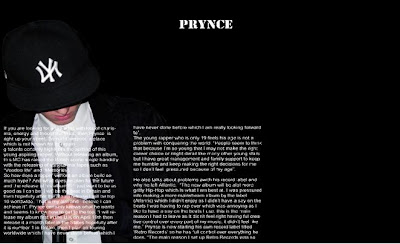
This is my first design of my Double Page Spread. As you can see it looks very plain and basic and there is also a lot of empty space. Also the main title does not not stand out and looks too small. I kept the image in the same place for my final design and also kept the same coloured font.

No comments:
Post a Comment